Grad Goggles

A virtual yearbook experience for students graduating during the COVID-19 pandemic.

In 2020 schools and colleges shut down abruptly, along with graduation ceremonies, celebrations and farewells. A group of students from my batch created GradGoggles, a virtual yearbook platform for graduating students to have a chance to connect, reminisce and celebrate with each other.

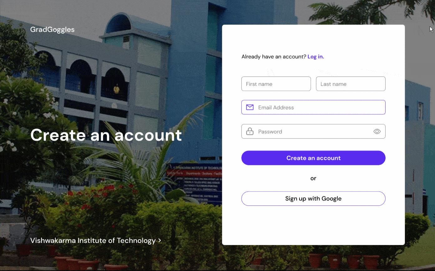
In 2021, I was asked to redesign the platform for the newly graduating batch with the goal of increasing engagement, improving usability and scaling to more colleges.
Project Type
Community Project
Duration
Apr - May 2021
My Role
Product Designer working with 4 developers
Outcome
Improved UX increased users 7x on www.gradgoggles.com
What is the problem?

Students graduating during the pandemic missed out on the final years of their college experience.

With schools and colleges closed indefinitely, students felt disappointed about not being able to meet their friends, having no formal celebration, and no closure from ending a big chapter of their lives.
user pain points

This redesign aims to solve core problems that users faced on the existing platform:

  • Counter-intuitive interface and navigation that left users confused about the platform.Goal -> Redesign the platform to be more intuitive and closer to the real life experience of a college yearbook.
  • Low engagement post sign up because of low awareness and adoption of the commenting feature, Scraps.Goal -> Make scraps more visible and accessible to increase engagement.
  • Old UI served only as a platform to browse profiles.
    Goal -> Design the platform to be more engaging and personalized to bring a feeling of nostalgia and connection.
  • Initially designed statically for only one college; the design was not scalable.Goal -> Accommodate the design (especially the onboarding) to scale up and include multiple colleges.
who are the users?

The target users included college students graduating in 2021 from different colleges across India.

Rhea, college senior

Problems:
  • Graduating during the pandemic feels like "another random Tuesday".
  • Can't meet or celebrate with friends to mark the occasion.
  • Did not get a chance to fully enjoy her college experience.
  • Online classes throughout the year were new, difficult to adapt to and frustrating.
Goals:
  • Connect and reminisce with friends and batchmates one last time.
  • Have a memento or an event to commemorate this milestone.
  • To bring a sense of closure to this chapter of her life before moving on.
problem statement

So, what am I trying to solve?

Students graduating during the COVID-19 pandemic need a way to connect with their friends and celebrate their graduation, so that they can commemorate a big milestone and not miss out on college experiences while stuck at home.
proposed solutions

Make browsing profiles quicker using infinite scroll

The old UI used pagination to display the student profiles which:
  • Was not an efficient way to find friends from amongst 1000s of profiles.With only 3 profiles per page, finding friends was time consuming and tedious, requiring multiple clicks.
  • Had a long page load time.
Old UI using pagination
Solution

Lay profiles out as an infinite scroll to make scanning and finding friends quicker, similar to scanning a crowd and picking out your friends in real-life.

The highlighted department names serve as an anchor for the user to remember their position in the infinite scroll.
Redesigned UI using an infinite scroll interaction with Department names as a position marker.

Increase engagement by commenting on friends' profiles using Scraps

Scraps = comments. The idea for scraps originated from a tradition at my college called Scribble Day, where graduating students write nostalgic messages on each other's t-shirts.
Why Scraps didn't drive engagement with the original design:
  • Overlooked functionUsers were not aware that the scraps feature even existed.
  • Set to disabled by defaultUsers did not know that scraps needed to be enabled on their profiles.
Users were not aware of the Scraps feature on the old UI
Solutions
  1. Hover state on the user's profile card that shows the number of scraps.This way the Scraps feature is brought onto the home page instead of one click inside.
  2. Scraps visible on a profile by default.
  3. Notification sent to the user when a scrap is posted on their profile.After launch, we found that this feature encouraged cross commenting between users and heavily contributed to the boost in engagement through scraps.

18,852

scraps posted on the redesigned platform
Hover state that acts as a signifier for scraps
Redesigned profile overlay showing scraps enabled by default

Create a feeling of nostalgia using personalization

College is an experience that revolves heavily around close connections and fond memories. By introducing personalization features we could bring the user closer to their friends and capture that feeling of connection and nostalgia on the platform.

Save close friends' profiles to the Close Friends tab

Users can star their close friends' profiles and save them to the Close Friends tab. This is a way to find and interact with friends quickly without having to scroll around or search.

3046

close friend pairs created on the redesigned platform
Save friends profiles to the Close Friends tab to access them quickly

Friend suggestions based on common interests and college clubs

During onboarding students can select which clubs or events they were a part of, as well as their interests in college. Students with matching interest tags would be filtered to the top of the department list.

This feature didn't make it onto the published site due to lack of time to implement.
Filter friends with common interests at the top of the page

College specific onboarding

One of the main goals of the redesign was to scale the platform for multiple colleges. We personalized this experience by including college specific images and departments right from onboarding.
Onboarding flow tailored to each college

Other Screens

A downloadable department photograph to save as a memoir
Common college wall where students can share memories, photos or videos

Mobile Screens

Yearbook home page
A user's profile view
User onboarding
impact & results

After launching for the first college we received an overwhelming response of over 1000 active users in a day at peak.

We found that the success of the redesigned platform owed to users adopting scraps as a major feature, notifications that encouraged users to post scraps on each others' profiles and the close friends tab that made commenting back and forth quicker.

44k

total sessions since launch in May

1200

more users than the 2020 edition

1433

grads signed up

Usability Testing

Lorem ipsum dolor sit amet, consectetur adipiscing elit. Suspendisse varius enim in eros elementum tristique. Duis cursus, mi quis viverra ornare, eros dolor interdum nulla, ut commodo diam libero vitae erat.

6/7

avg. usability rating

Success

Pain points

future scope

If I had more time I would implement

Awards and voting

Engagement feature which allows users can vote on categories like 'Most likely to become a faculty', 'Class clown', 'Most likely to be a millionaire' and so on.

Year round engagement

The current platform is relevant during graduation months (May, June, July) when students are fresh out of college. How can we enhance the platform to drive engagement year round?

More personalization through interests/clubs

Personalize the experience even more through friend suggestions based on common interests.
learnings

What I learned from this project

That I enjoy working with developers and a team
Understanding the feasibility of design solutions was very insightful and brainstorming alternate solutions collaboratively made working a lot more enjoyable!
The importance of user feedback, testing and data
Gaining insights from users improved the success of the redesign greatly and was useful to inform future iterations.
To stand up for details
I had to learn that being nitpicky about details is part of my role as the sole designer on the team. It was important that I ensured that they were not overlooked in the development phase.

Thanks for scrolling! Check out my other projects: